

Soundproofing and interior design are two worlds that rarely cross paths. But today’s homeowners are more design-conscious than ever. We’re no longer content with plain grey foam stuck on the wall. We want acoustics that work and interiors that wow.
Enter Pantone-coloured sound absorbing panels—where form meets function, in full colour.
If you’ve seen these vibrant panels online or in showrooms and thought, “Those are gorgeous, but how on earth would I make them work in my space?” — you’re not alone. The truth is, with a bit of planning, these bold panels can blend seamlessly into just about any room theme, from sleek and modern to cosy and rustic.
1. Start with the Mood You Want to Create
Every room has its own energy. Some spaces are meant to feel calm and restful, others are designed to energise or spark creativity. Your colour choice should align with that mood.
- Want calm and focus? Stick with cool tones like Pantone’s Classic Blue, sage green, or soft greys.
- Want warmth and conversation? Go for earthy shades like Burnt Coral, terracotta, or mustard.
- Want a punch of personality? Try bolder picks like Viva Magenta or electric teal in creative spaces, playrooms, or studios.
Designer tip: Choose no more than three main colours in a space. Let the sound-dampening panels either complement or contrast one of those tones—never compete with all of them.
2. Match Panels to an Existing Colour Palette
If your room already has a defined colour scheme, you’re halfway there. Look at the dominant tones in your:
- Walls
- Curtains or blinds
- Rugs and cushions
- Furniture finishes
Then, pick Pantone-coloured panels that either:
- Match one of those tones (for a coordinated, monochromatic look)
- Contrast with them (for a focal point or pop of colour)
Let’s say you have navy blue cushions, warm timber floors, and off-white walls. A set of mustard yellow acoustic panels on one wall could introduce a striking focal feature, while still working with your overall palette.
3. Use Panels as Art or a Feature Wall
Here’s where it gets fun—your sound absorbing panels don’t need to hide. In fact, with Pantone-inspired colours, they can become the artwork. Consider using them to:
- Create a geometric layout (hexagons, stripes, or colour blocks)
- Frame a specific area like the bed, desk, or TV wall
- Act as a headboard alternative using soft upholstered panels in a complementary hue
- Build a gradient wall by using several shades of the same colour from dark to light
Pro styling trick: Lay out the panel arrangement on the floor first, especially if you’re mixing colours or shapes. Snap a photo to visualise how it’ll look on the wall.
4. Let Texture Do Some of the Work
Colour gets all the credit, but texture is just as powerful when it comes to blending panels into your space. Many Pantone-coloured acoustic panels are made with felt, wool, or fabric covers—materials that add softness and depth to any room.
- In modern, minimalist rooms, a textured panel in a neutral Pantone hue adds subtle interest.
- In rustic or eclectic spaces, choose thicker panels or slatted finishes that mimic natural materials.
- In luxe interiors, velvet-style acoustic panels in jewel tones like emerald or sapphire bring in opulence and calm the echo.
Remember: Even neutral tones can feel exciting if the texture is rich.
5. Mix with Other Design Elements
If you’re worried about the panels looking “plonked on,” the trick is to tie them in with other décor items.
Try echoing the colour of your panels in:
- A matching throw blanket or cushion
- A piece of artwork or vase on a nearby shelf
- A rug that carries a hint of the same tone
- Light fixtures with coloured glass or metal finishes
It creates a layered, intentional look, and suddenly, your acoustic panels feel like they were always meant to be there.
6. Think Room by Room
Every space has different acoustic needs and a different design brief. Here’s how Pantone-coloured panels can work in specific settings:
Bedrooms
Soft mauves, olive green, dusty rose, or muted blues keep things calm. Go for upholstered textures. Place panels behind the headboard or on the wall opposite the bed.
Living rooms
Try burnt orange, navy, or greyish greens. Use panels as a gallery wall substitute behind the sofa or around the TV.
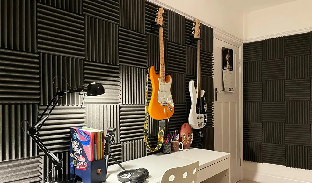
Home offices
Think sharp, clean tones like deep blue, graphite, or Pantone’s “Very Peri.” These support focus and productivity without being dull.
Creative spaces/playrooms
Go bold. Mix colours! Just make sure the surrounding décor isn’t also fighting for attention. Let the panels be the hero.
7. Don’t Forget the Ceiling
Yes, Pantone colours can go up. Ceiling-mounted acoustic panels in subtle tones (like dusty blue or charcoal) can double as floating “clouds” that absorb noise while making the space feel warmer and more intimate. Perfect for dining areas, home theatres, or even offices.
Final Thoughts: Don’t Let Acoustics Limit Your Style
Pantone-coloured acoustic panels prove that you don’t have to compromise between great acoustics and beautiful design. With the right palette, layout, and finishing touches, your sound solution becomes part of your home’s character, not something to hide.
So don’t settle for beige, don’t fear colour, and definitely don’t leave your walls (or ears) bare.
